From Kawakakkoii to Superheroes: Interview with Acky Bright – The Artist Behind ‘Knight Terrors: Angel Breaker’
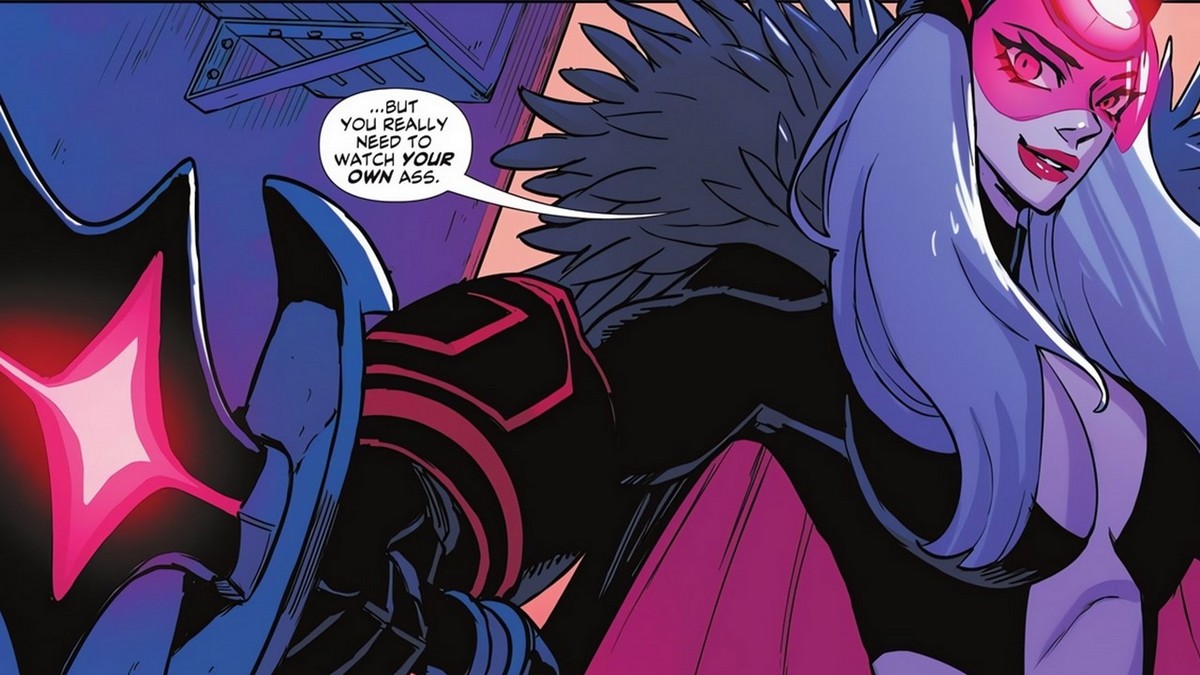
Acky Bright is a renowned manga artist and illustrator hailing from Japan. Mostly influenced by golden-age manga and anime with a love for black-and-white illustrations, his artistic journey was nothing short of extraordinary. Acky previously worked with Hasbro and BMW in Germany as far Western market goes, but his talent and potential likewise caught the eye of DC Comics, where he got the opportunity to explore superheroes with his creativity.
Acky’s latest DC project ‘Knight Terrors: Angel Breaker’ was recently released, so we decided to ask a few questions regarding his transition from manga illustrations to the world of DC and what his future prospects look like.
Comic Basics: You are primarily a manga illustrator; what motivated you to brave the waters of comic books, and which media is easier to illustrate? What are some significant differences when approaching manga artwork and comic artwork?
Acky Bright: That’s right. There aren’t many artists who simultaneously draw manga and graphic novels, including their past works. Especially here at DC Comics, I can say I’m a unique presence.
This is truly thanks to the editor, Ben. He discovered me when I was still relatively unknown in America and gradually provided me with opportunities, starting with variant covers. Being able to be a part of DC Comics, which I have admired since my childhood, is a happy time for me.
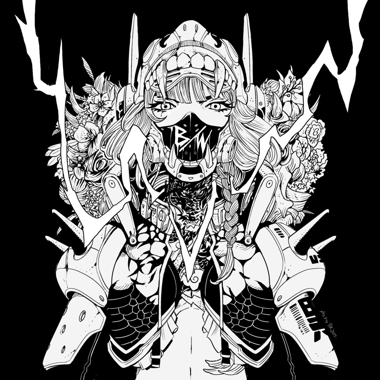
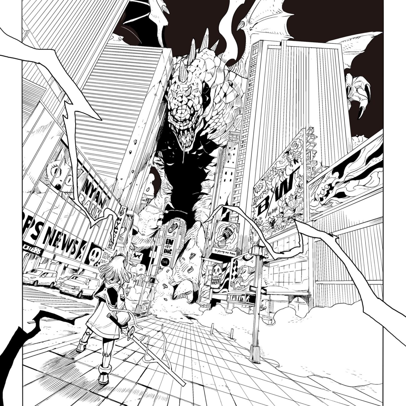
My roots are undoubtedly in the manga, but at the same time, I also love Batman and Superman, both of whom have influenced me.
Each has its own advantages in terms of ease of drawing, making it enjoyable to work on both. I had a great time drawing Angel Breaker this time around.
Related to the first question, your art style combines manga and Western influences. How did you balance these two styles?
In Graphic Novels, the arrangement of panels and the use of speech bubbles differ from Manga. I adhere to the style of Graphic Novels when drawing. When creating a Graphic Novel, I focus on minimizing the deformation of characters and drawing them with a solid foundation from their skeletal structure.
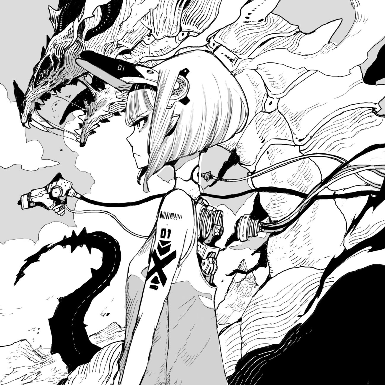
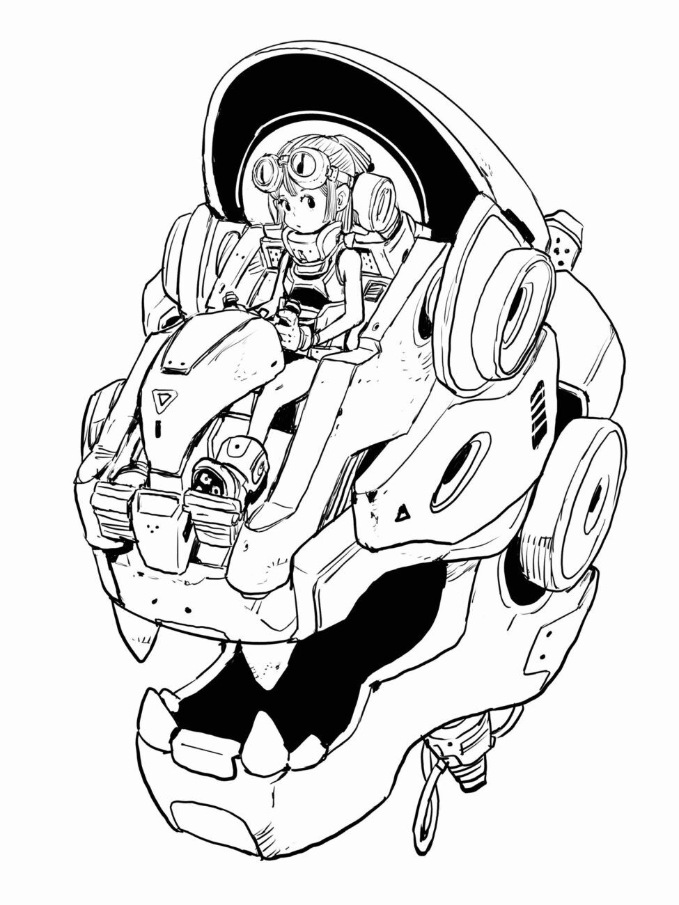
By combining elements from both Manga and Graphic Novels, I think I’ve developed a unique style. My Graphic Novel style is still a work in progress, and I’m trying to create even more powerful art in the future.
I will continue drawing Manga in the future, so there might be some influence from the Graphic Novel as well. Eventually, these two styles may blend together. I am looking forward to seeing how my own style will evolve and what kind of style I will develop in the future.
Did you face any challenges while you were making the transition?
DC’s characters have indeed been passed down through generations and have become cherished by DC fans. Therefore, my main focus was to ensure that fans would enjoy my work, and I couldn’t help but feel nervous about whether they would accept it until I saw the reviews.
Nevertheless, I believe that I was chosen for this project because they were looking for Acky Bright style, so I confidently challenged it with my own sensibility and art style.
‘Knight Terrors: Angel Breaker’ was just recently released, and the reviews are amazing. What was your approach and inspiration behind the art?
First, I took the intent of Tim’s script and tried to make the most of it. I also used the red light of Angel Breaker’s sword well while keeping the light to a minimum to create a horror atmosphere, especially in the second half. I was conscious of camera work and storytelling so that readers would not be bored. I also focused on the expression of fear, such as the extremely large eyes, as a horror effect.
How did you keep the consistency between ‘Knight Terrors: Angel Breaker’ and ‘KnightTerrors: First Blood’?
Since the setting was consistent, I deliberately didn’t focus on artistic consistency. Angel Breaker has one of the greatest designs of any recent character.
What are some of the aspects of you especially focused on when you were designing the costume and the appearance? I’m particularly interested in red visor and sword.
As you said about Angel Breaker, it is a finished design, so I drew it with respect to the original design. When I first sketched it, it felt right to me, so I drew it as is. I was able to use the red light on her sword and forehead very effectively in the production. I also talked with Tim and Ben and painted her eyes this time.
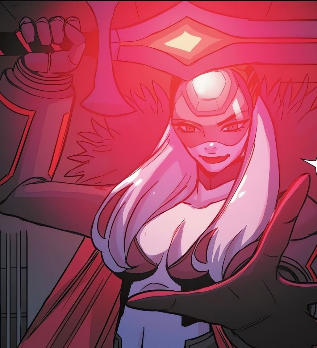
In this work, she is sometimes charming, sometimes frightened, and shows a human side, so I wanted to draw her eyes well so that readers could easily get emotionally involved with her.
The issue features some of the lesser-known characters whose appearances are not as iconic, and they don’t have, let’s say, “iconic looks’ that you need to respect. Was it easier to design them or harder?
Character design is the part I am most recognized for, so I thoroughly enjoy creating it. This time, I designed four boys and girls, as well as Lady Mannon and Nanny Gillo. Most of the designs were based on the initial images that came to my mind while reading the script.
Both Tim and the editor, Ben, liked it. Being able to bring new characters into the DC world, even if they are supporting roles, is truly exciting.
What was your favorite (and most difficult) panel to illustrate and why?
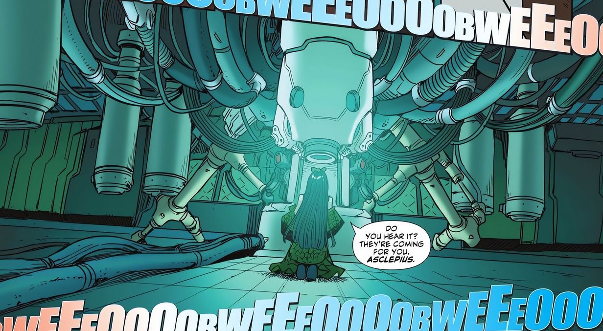
I like the first scene of Raptor’s appearance. I started from this page, and when I finished this picture, I felt that I could create something good this time. I also like the scene of the huge equipment in the underground lab.
What are some of your upcoming projects that we can look forward to, if you can discuss them, of course
In DC Comics, there are plans to illustrate variant covers for other titles. Additionally, there is a scheduled live drawing on a giant canvas during the Batman Day event in Tokyo. My Artbook ‘B/W’ is also getting released soon; you can check out more info by following this link.
You can check out more of Acky’s work on his official site, Instagram and Twitter.

